Dashboards and KPIs: Unlocking the Power of Your ERP System
By Rob Drover, Vice President of Business Solutions, Marcum Technology

The term enterprise resource planning (ERP) was first used by the Gartner Group in the 1990s to combine material resource planning and material requirements planning. It has since evolved and matured to encompass many facets of a company’s operation, including finance, manufacturing, supply chain, and customer relationship management. The overall concept was based around a fully integrated financial ledger. Every transaction that had a financial impact was immediately reflected in the financial ledger and/or other associated modules. This eliminated the batch approach to transaction processing that was common before the advent of ERP solutions. Perhaps the most famous ERP was SAP, originally developed in Germany.
Early ERP systems were based on mainframe (green screen) technology and were typically the domain of multi-national public companies. “Today’s ERP systems are available to organizations big and small, and they often run as cloud-based software as a service (SAAS) applications.” Prices start as low as $10K per year. Prominent vendors in the middle-market space include Acumatica, Microsoft Business Central, NetSuite, and Sage Intacct.
The modern ERP is typically a web-based platform with a highly intuitive user interface. Most common business functions are easily configurable and the need for custom coding has been largely eliminated. SaaS systems offer every customer the benefit of development built for all customers. As new features are released, every customer has immediate access. With the tremendous volume of transactional data generated and available to ERP customers, the challenge has become visualizing that data to drive meaningful management and business decisions.
Business intelligence (BI), data analytics, and data mining are just a few of the terms used to describe an entire software industry built to help extract data from ERP and related database systems. Again, the typical software lifecycle has played out in this space: At their outset, such tools were the domain of large BI providers like Cognos and Tableau. They were expensive and relatively difficult to integrate into your ERP system.
Fast forward to 2022: Your typical ERP platform has more capability embedded within its built-in dashboard than were available in large, expensive software tools 10-15 years ago. These visual panels are configurable widgets that can be easily set up to present a wide variety of key performance indicators (KPIs) and other financial and operational data. Presentation methods are endless and range from gauges, graphs, and lists to color-coded tiles and ticker-based scrolling notifications. Most systems support click-through. Utilizing a web-based hyperlink, the user can quickly drill through the data all the way to the underlying transaction(s) that drove the KPI.
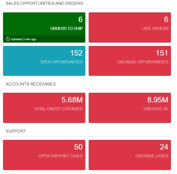
Figure 1. Color-coded, tiles-based KPIs show the number of items included in the measurement. Users can click through to the underlying data.
Dashboard widgets are arranged on the page for optimal visualization and ease of use. Careful consideration should be given to the number and complexity of the data presented. Keep it simple and actionable.
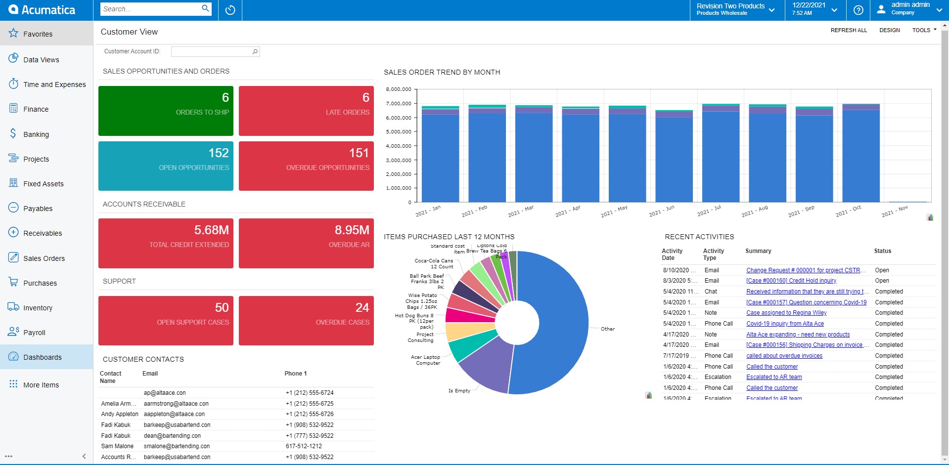
Figure 2. Multi-item dashboard featuring tiles, graphs, data lists, and drill-through data tables.
Dashboards are typically role-dependent. The data presented to senior leadership varies greatly from an accounts payable manager or a project manager. Each user is granted limited data access (responsibility) and a functional set of tasks they can execute (role). The combination of role and responsibility controls what they see and what types of data and action items are presented on each version of the dashboard or the job function menu.
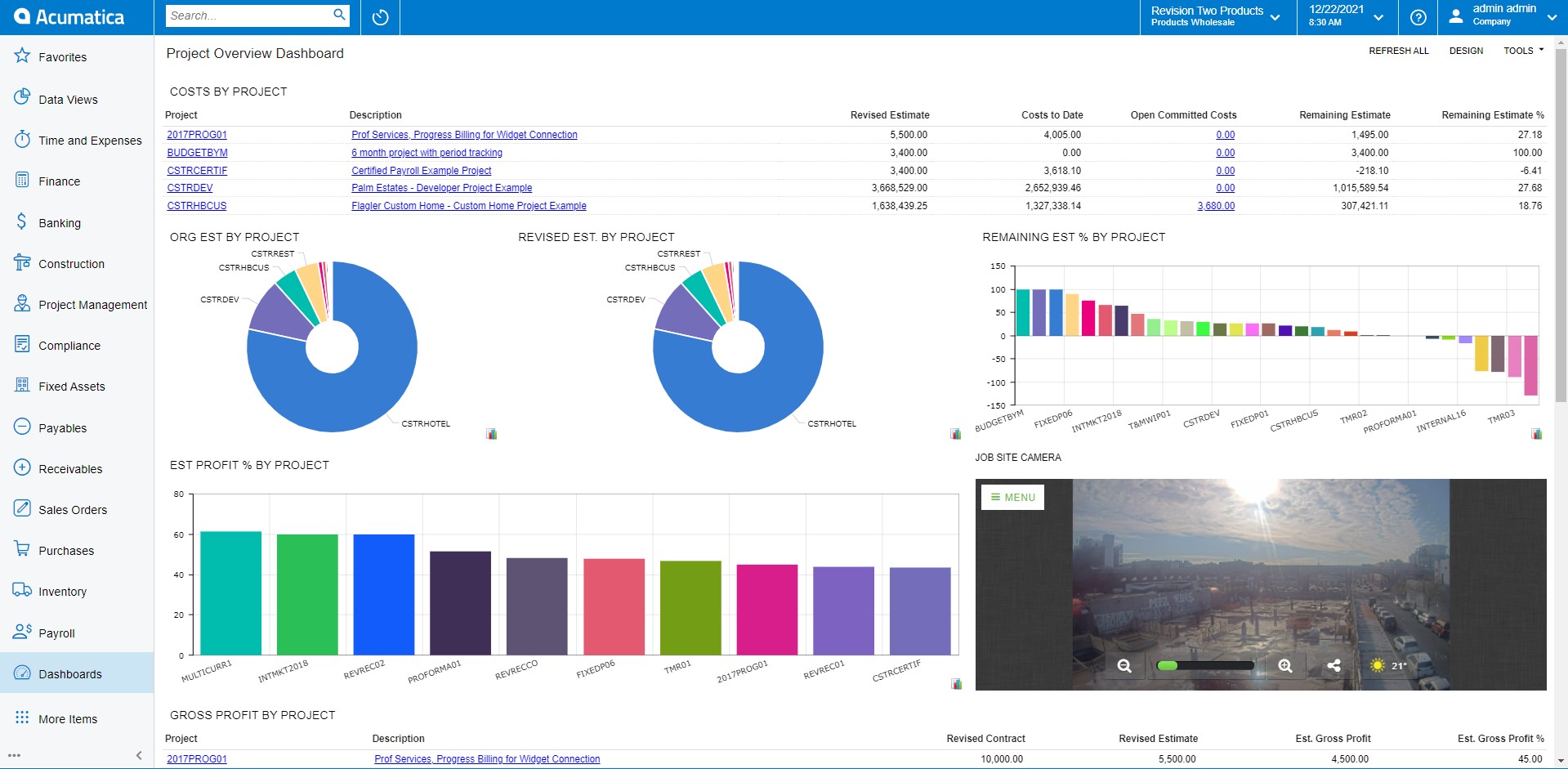
Figure 3. Role-based dashboard for a project manager role. Note the embedded video image showing a live video feed from the job site. In this example, job functions are displayed down the left and are directly tailored to the user’s role.
The path to developing and deploying effective, actionable, and impactful dashboards has is clear, yet organizations still struggle to achieve the promised value of the “one-stop shop” for data management. Here are some of the barriers ERP customers encounter on this journey.
- Operational systems not integrated under an existing ERP proliferate.
It is important to determine both the system of record and the system or database that supports the dashboarding or reporting. If possible, avoid multiple sources and consolidate all the data into a single repository. An ERP system is typically the center of this data core. - Customers use “multiple versions of the truth,” including the ubiquitous Excel report that often ignores or misrepresents core data that is also available in the ERP.
It is incumbent upon management to only accept a single version of the truth. Push back on those who try to poke holes in the data for their own purpose. Ask them to proactively resolve any data issues or accept the results as-is. If a manager’s bonus is directly tied to the designated system report, they will ensure that the data is correct! - Dashboards are built, deployed with great fanfare, and then either ignored or allowed to fall into disrepair.
Data management takes ongoing work to implement and maintain during operation. Be sure to budget for that support. Despite the prevailing wisdom, systems do not run themselves. Master data changes, new business scenarios pop up, and staff turnover occurs. All of these affect the quality of the data. - Many users do not have the patience to deal with the inevitable data anomalies that arise in a new, highly integrated system. They quickly lose faith in the system and retreat to the spreadsheet. (See #2 above)
This situation occurs so frequently, it should probably be the No. 1 risk item on every project plan. Why do we trust the spreadsheet over the dashboard? Likely because we think “our control” equates to accuracy. In fact, the reverse is more than likely true. It is essential that clients invest in the quality of their data. Like any good investment, it takes time and patience. Do not view a data anomaly as a catastrophe; instead, see it as an opportunity to dig a little deeper into the system and fix the quality issues. Give it a try—you will be amazed at what you learn about your own data. - The dashboard isn’t the customer’s first stop each and every day.
When you get in your car every morning and begin driving down the road, what do you look at first? Hopefully you scan your dashboard for critical measurements like your gas gauge and any warning lights that will affect your drive. The health of your business is no different. Before you open your email, grab your cup of coffee and settle down in front of your operational dashboard to find out what is really going on in your company. You will be glad you did.
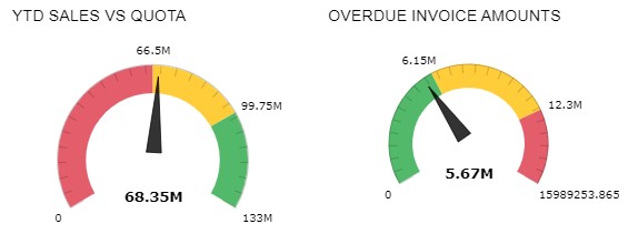
Figure 4. Gauge-based dashboard complete with color-coding and data measurements. Ranges are fully configurable.
If you are interested in learning more about the best-in-class Enterprise Resource Planning (ERP) contact us at [email protected] today.


